
Corporate Design · MYKILOS
Art Direction and graphic for the Berlin-based interior and furniture design label
↓
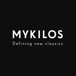
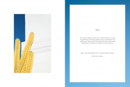
Logo· Re-adaptation
In order to simplify the CI design the original primary logo got replaced by the textual logo which uses the CI font SuperGroteskA. The reason for this change was the need for visual consistency and efficiency throughout all mediums. The logo was set in few sizes and secondary variations of colors to fit different formats and graphic layouts which can be seen on the style guide (next page).
→
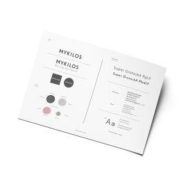
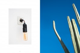
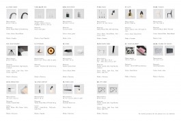
Style Guide
Created a a comprehensive style-guide to align all current and future collaborators and maintain consistency along digital and print media.
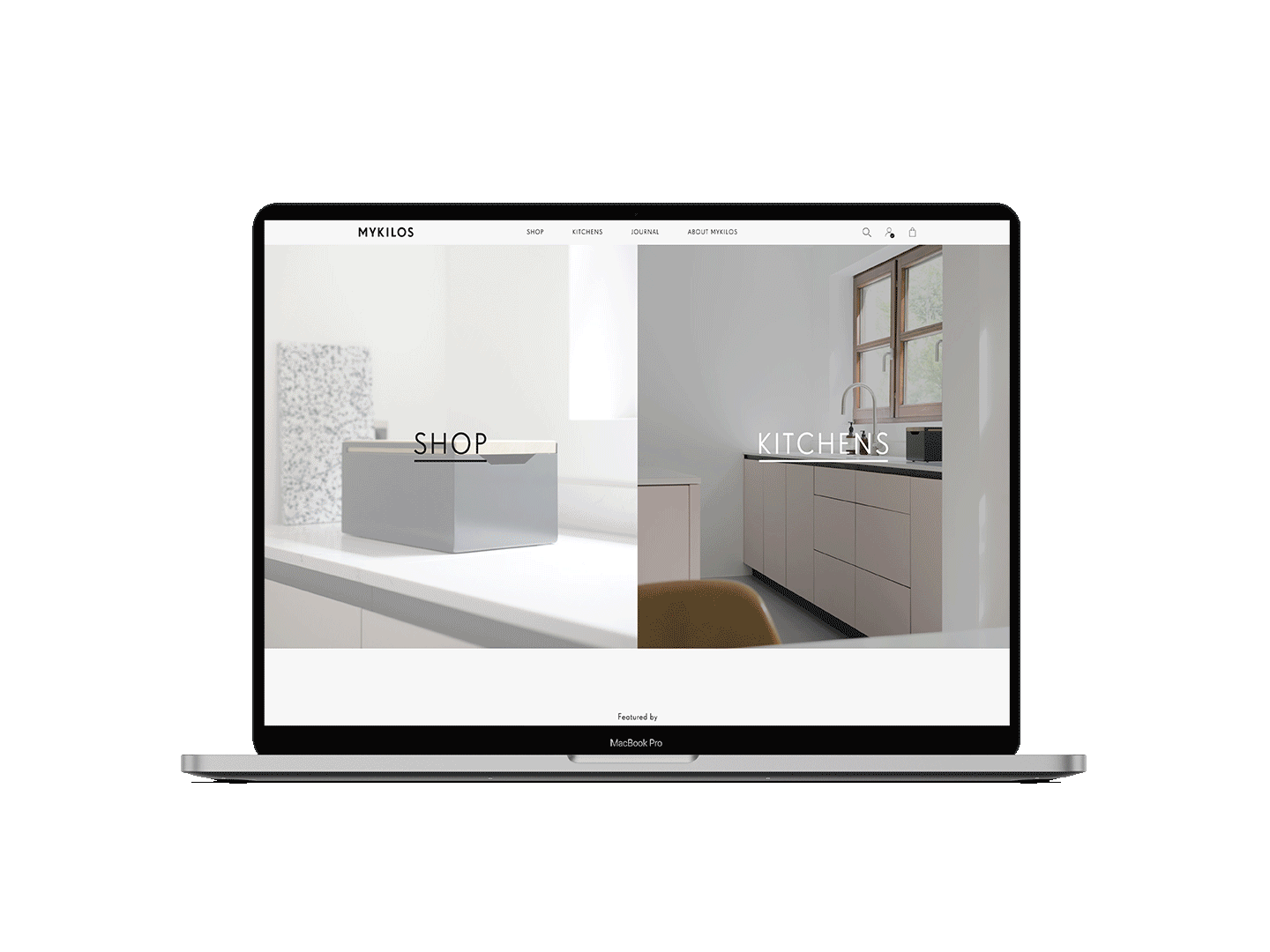
mykilos.com · Webdesign
The goal here was to completely align all brand visual elements with its unique style. The leading motives for this branding project include clean lines, sharp edges and monochromatic color palette.
The first task was defining the logo and a tagline which would appear along all visual outputs that include digital, print and packaging. Therefore a styleguide was created with all relevant elements to direct stack-holders through new designs.
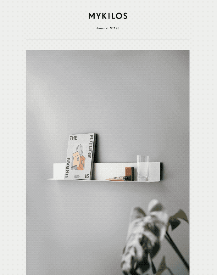
Journal · Newsletter
A Bi-monthly newsletter designed to showcase recent brand news and product promotions. The simple layout and sans serif font align with the contemporary look and feel of the brand's CI.
Social Media
Content curation and creation for social media platforms to pose strong identity and presence in the market. Content includes, along products and projects, a series of follow ups from the newsletter content related to kitchen and interiors.
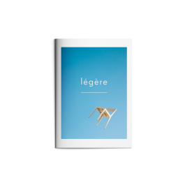
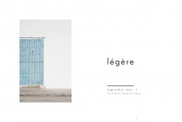
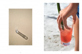
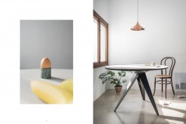
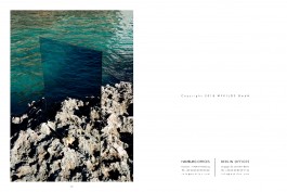
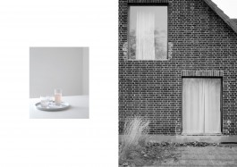
Légère · Summer Catalog
This catalog had one main objective; to showcase the brands' collection in a different perspective enhancing a feeling of lightness and calmness. The art direction for the images and the layout design was focused on creating a contrast between the products' rigidness and the lightness of the set-designs and locations.
The catalog and content was directed and produced by Tal Engel with Mykilos' team support.

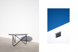
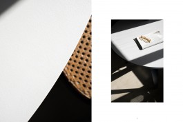

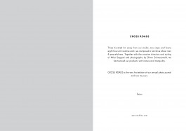
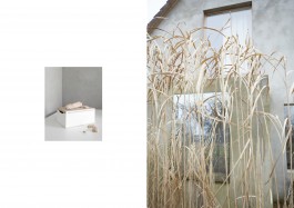
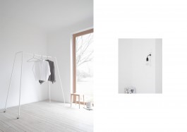
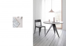
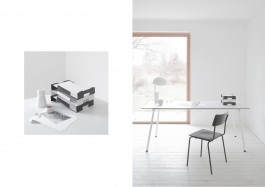
Cross Roads · Winter Catalog
The goal here was to completely align all brand visual elements with its unique style. The leading motives for this branding project include clean lines, sharp edges and monochromatic color palette.
The first task was defining the logo and a tagline which would appear along all visual outputs that include digital, print and packaging. Therefore a styleguide was created with all relevant elements to direct stack-holders through new designs.


Corporate Design · MYKILOS
Art Direction and graphic for the Berlin-based interior and furniture design label
↓
→