

Design and content curation for the new website of C's* - a contemporary jewellery brand
Time-line#1 month | Tools#Sketch#Invision#photoshop | Tags#webdesign#user Interface#wireframing#mockups#responsive design |

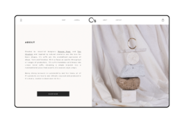
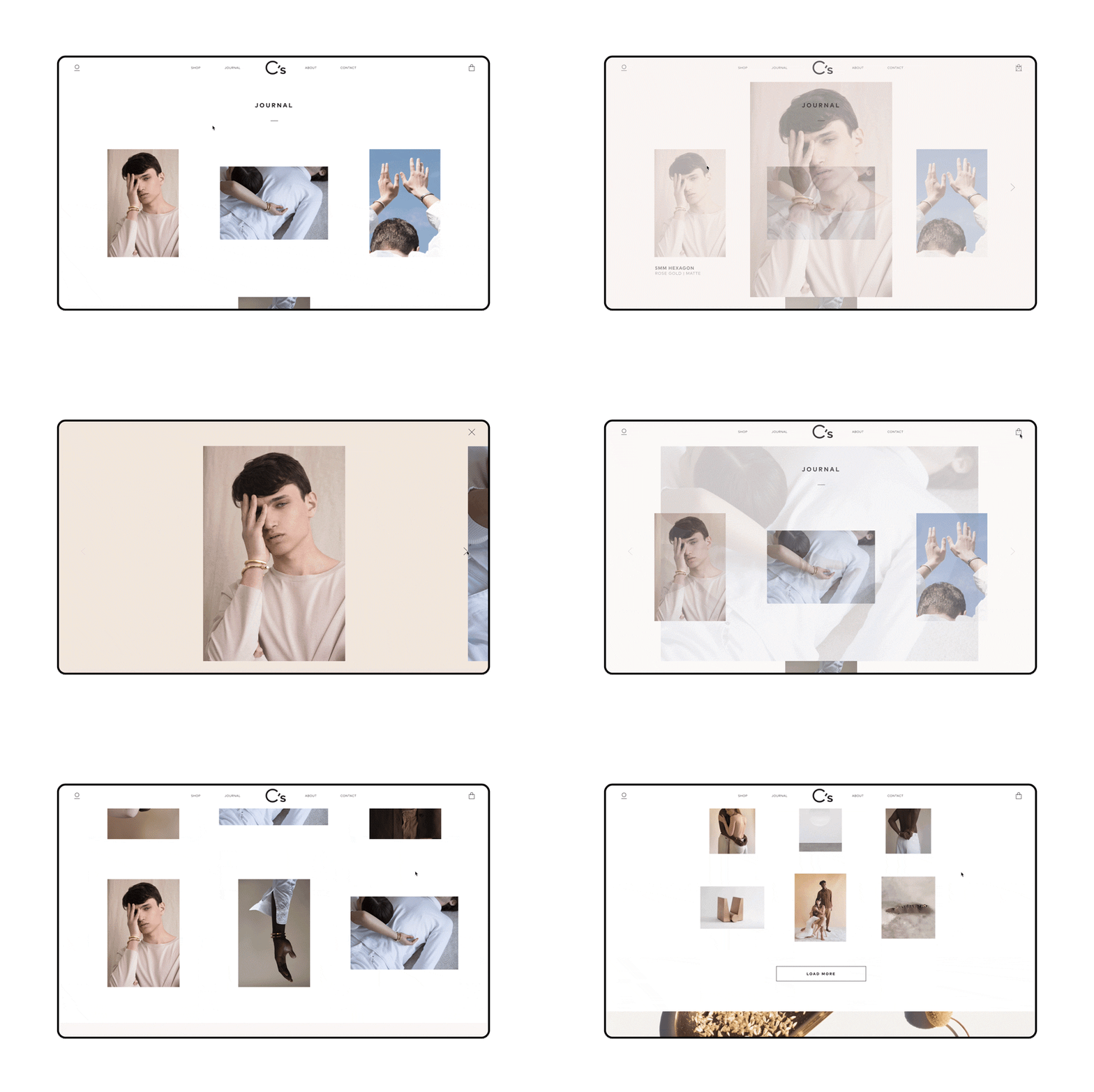
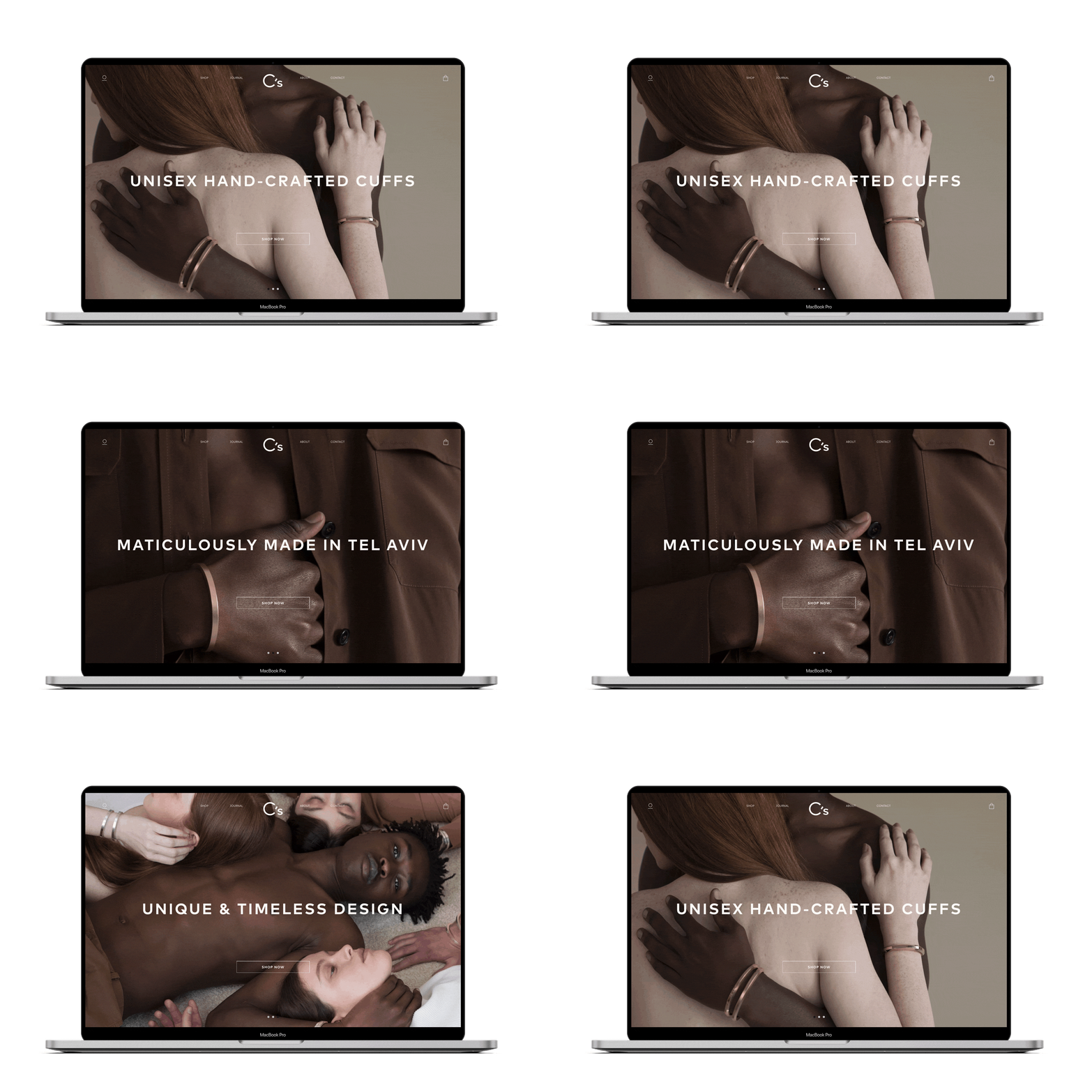
C's is a design brand focused on hand-crafted cuffs. As the brand developed, they commissioned me and a developer team to redesign their website. The challenge here was designing a web-shop which that would manifest the same unique, contemporary brand identity while aligning with newly adjusted business and marketing objectives to gain revenue.
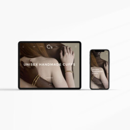
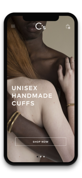
According the brand's data analysis it was clear that the majority of the target users are mobile-oriented. The main traffic of the online shop leads emerged from social media platforms such as Instagram and Facebook. Therefore it was crucial to put the focus on the mobile experience first and use it as a base for the desktop version.
Start page
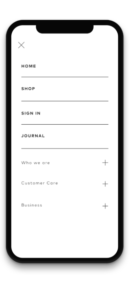
Menu
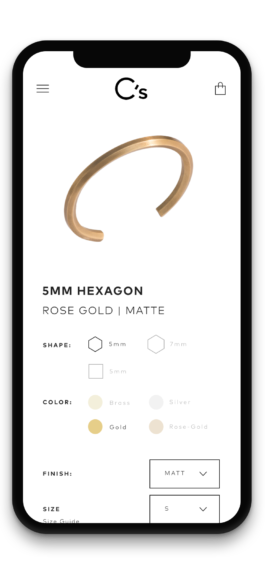
Configurator
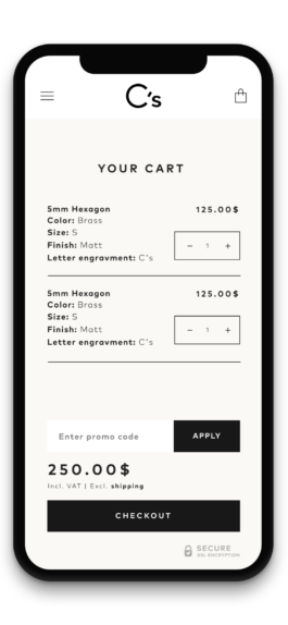
Cart
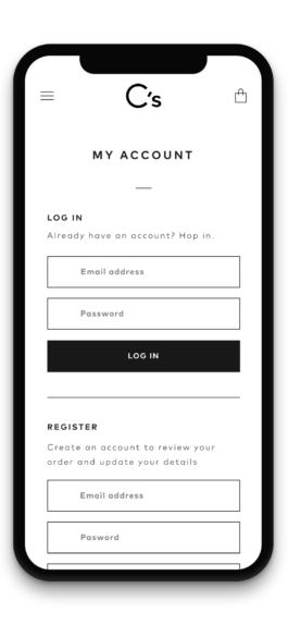
Account/Log in
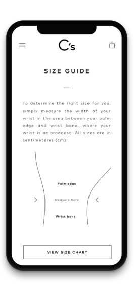
Size guide


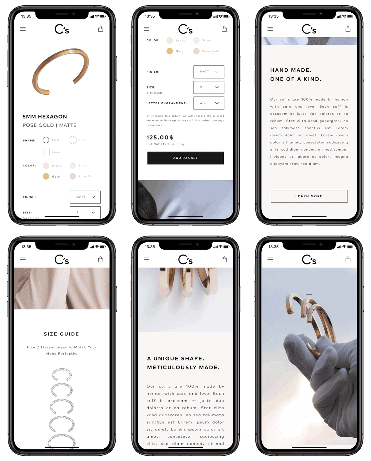
The shop design was based on a Wordpress & WooCommerce combination framework. To match to the brand's look and feel I have aimed for an elegant yet simple design that allow a straight-forward, easy e-commerce experience.
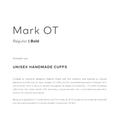
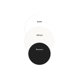
The goal here was to completely align all brand visual elements with its unique style along all communication mediums and their channels. Leading motives for the re-branding included clean lines, sharp edges and monochromatic color palette
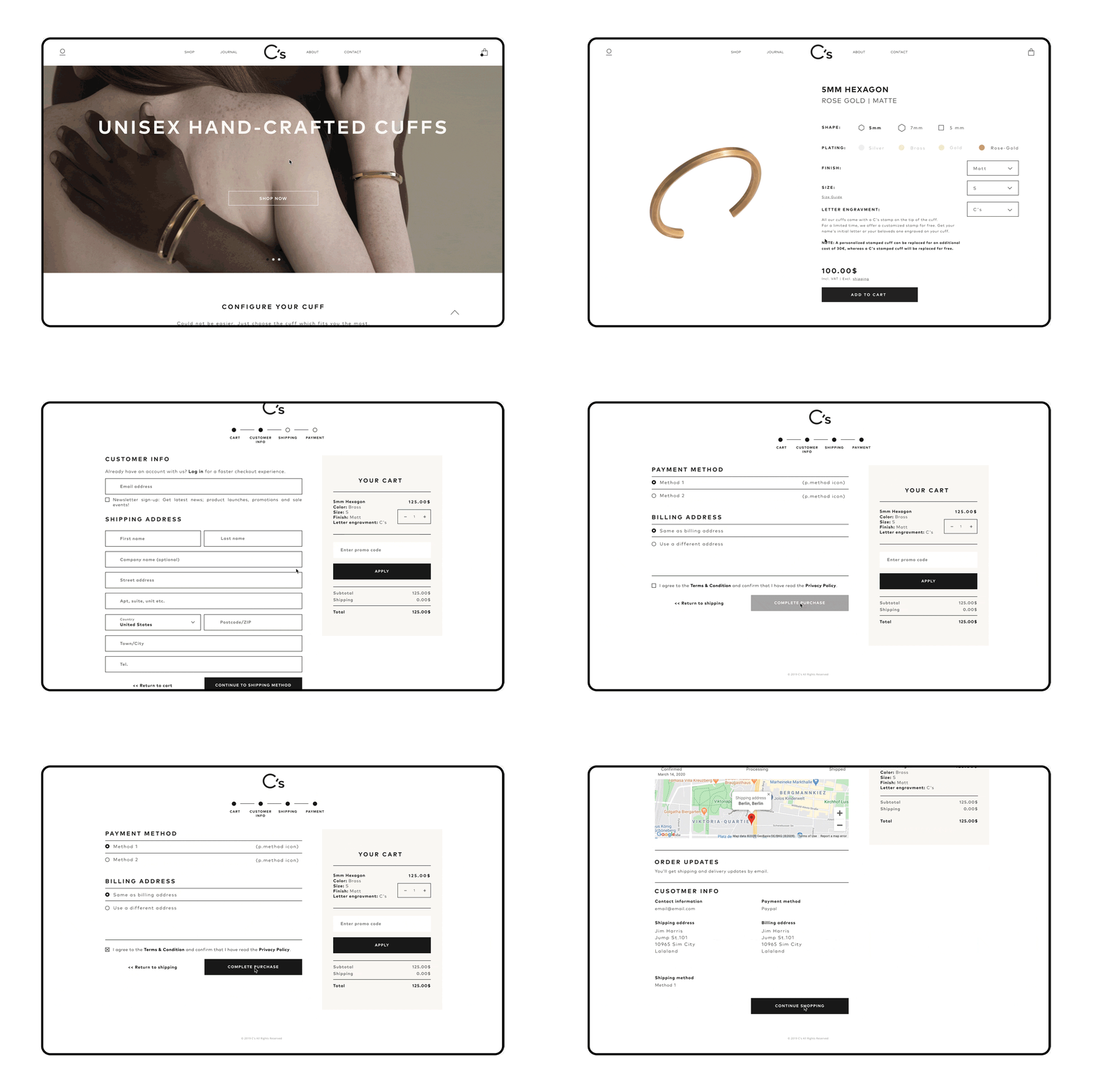

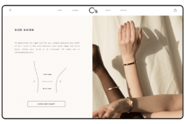
One of the core propositions of C's product is the ability to determine the right hand-cuff size online. For this I have worked with the brand's designers to develop a visual guide that is comprehensive and accurate. This guide includes illustrations, size chart and a CTA for further information.
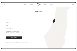
Since the product itself is hand-crafted, proximity played a key asset of the brand. To support this and the brand's transparency I have highlighted its geographical location using a simple and neat illustration along the contact details.


Design and content curation for the new website of C's* - a contemporary jewellery brand
Time-line#1 month | Tools#Sketch#Invision#photoshop | Tags#webdesign#user Interface#wireframing#mockups#responsive design |

C's is a design brand focused on hand-crafted cuffs. As the brand developed, they commissioned me and a developer team to redesign their website. The challenge here was designing a web-shop which that would manifest the same unique, contemporary brand identity while aligning with newly adjusted business and marketing objectives to gain revenue.


According the brand's data analysis it was clear that the majority of the target users are mobile-oriented. The main traffic of the online shop leads emerged from social media platforms such as Instagram and Facebook. Therefore it was crucial to put the focus on the mobile experience first and use it as a base for the desktop version.

Start page

Menu

Configurator

Cart

Account/Log in

Size guide


The shop design was based on a Wordpress & WooCommerce combination framework. To match to the brand's look and feel I have aimed for an elegant yet simple design that allow a straight-forward, easy e-commerce experience.

The goal here was to completely align all brand visual elements with its unique style along all communication mediums and their channels. Leading motives for the re-branding included clean lines, sharp edges and monochromatic color palette


One of the core propositions of C's product is the ability to determine the right hand-cuff size online. For this I have worked with the brand's designers to develop a visual guide that is comprehensive and accurate. This guide includes illustrations, size chart and a CTA for further information.

Since the product itself is hand-crafted, proximity played a key asset of the brand. To support this and the brand's transparency I have highlighted its geographical location using a simple and neat illustration along the contact details.

