Design and content curation for the new MYKILOS website / Programmed by SOHO Creative Group
Time-line#6 months | Tools#Adobe Suite#Adobe XD#Invision | Tags#webdesign/UI#wireframing#graphic design |
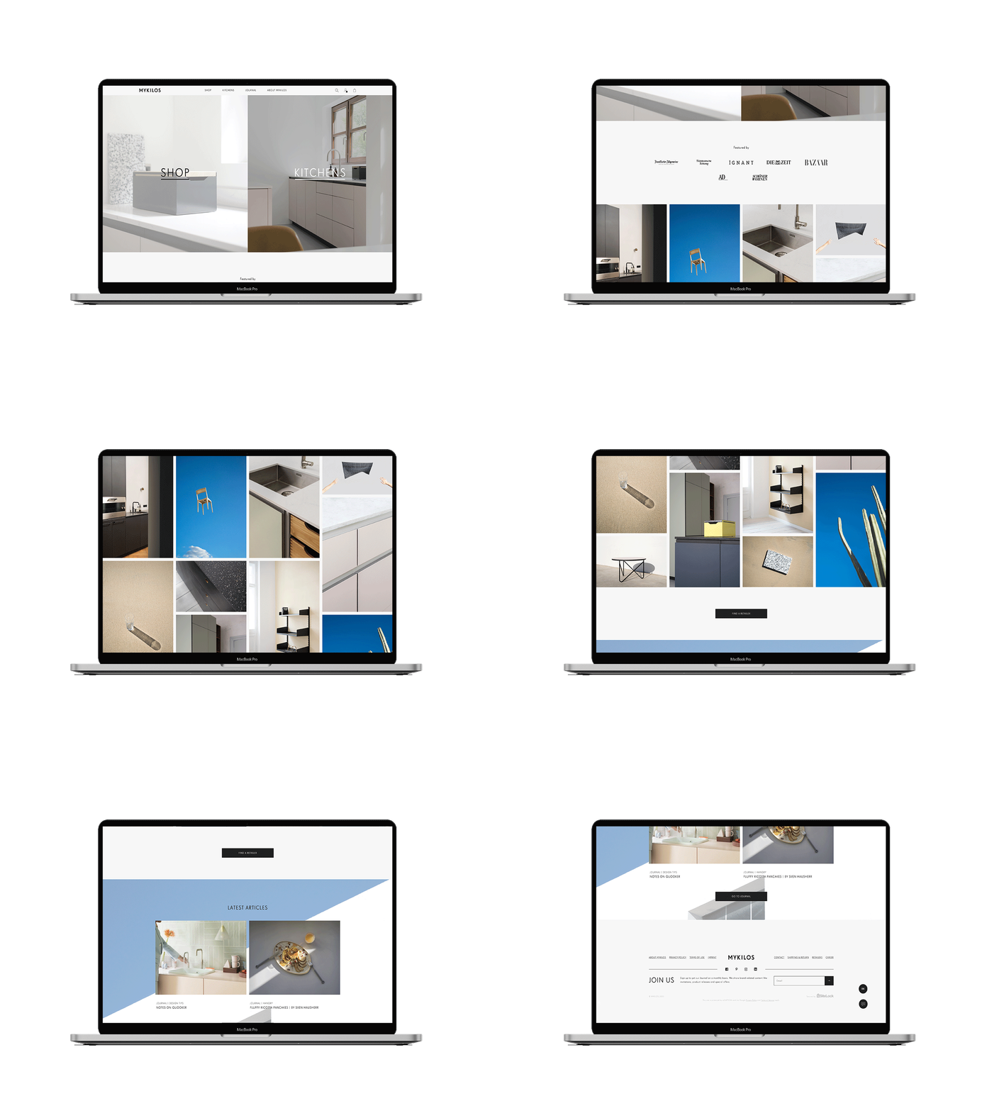
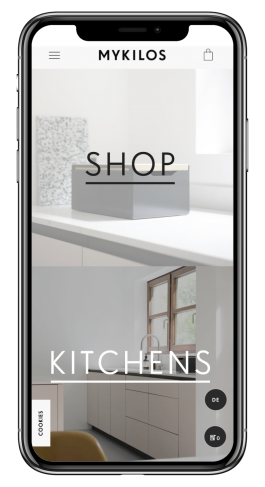
In order to align with the business requirements the goal here was to re-design the furniture webshop and combine it with the brand's interior design projects portfolio. The real challenge was creating one 'funnel' that directs different users to the relevant destination; shopping or design services. This was tackled by dividing the landing page into two main parts while keeping a sense of consistency within the UI styling.
Since the website was divided into two main departments; products and services, it was crucial that the landing page is designed in a coherent and straight-forward fashion. In order to allow a smooth user flow, the landing page acts as a 'funnel', consisting of two main 'hero' images representing each department. The rest of the page portraits the brand as in general.
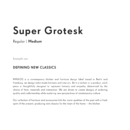
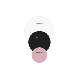
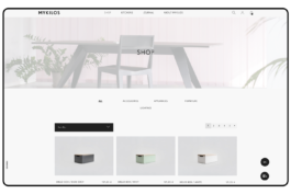
The goal here was to completely align all brand visual elements with its unique style along all communication mediums and their channels. Leading motives for the re-branding included clean lines, sharp edges and monochromatic color palette
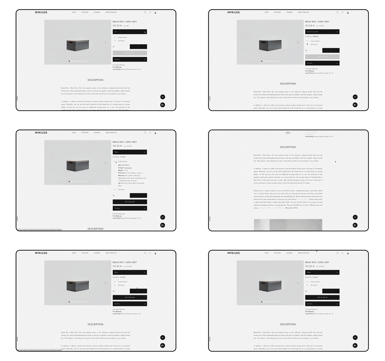
The second part of the brand's website includes a projects gallery portfolio with information and contact forms. This helped to teach users about the services of the brand and optimised the lead conversion with a straight-forward contact process.

Projects page
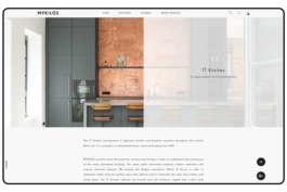
Designed as the main channel for gaining project leads by allowing users to book a meeting and enquire further information.
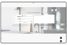
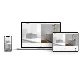
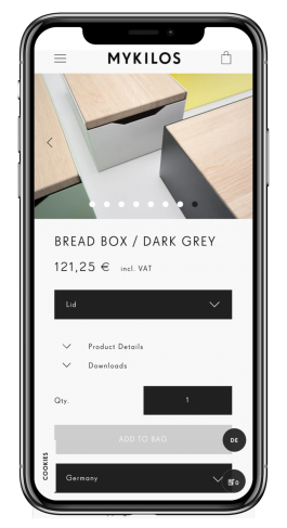
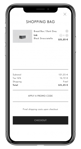
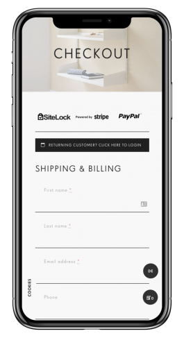
Designed to fit multi-screen scenarios for a maximum cross-device consistency.
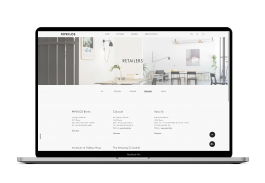
Retailers page
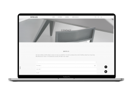
Contact page

Design and content curation for the new MYKILOS website / Programmed by SOHO Creative Group
Time-line#6 months | Tools#Adobe Suite#Adobe XD#Invision | Tags#webdesign/UI#wireframing#graphic design |
In order to align with the business requirements the goal here was to re-design the furniture webshop and combine it with the brand's interior design projects portfolio. The real challenge was creating one 'funnel' that directs different users to the relevant destination; shopping or design services. This was tackled by dividing the landing page into two main parts while keeping a sense of consistency within the UI styling.

Since the website was divided into two main departments; products and services, it was crucial that the landing page is designed in a coherent and straight-forward fashion. In order to allow a smooth user flow, the landing page acts as a 'funnel', consisting of two main 'hero' images representing each department. The rest of the page portraits the brand as in general.
The goal here was to completely align all brand visual elements with its unique style along all communication mediums and their channels. Leading motives for the re-branding included clean lines, sharp edges and monochromatic color palette


Projects page
The second part of the brand's website includes a projects gallery portfolio with information and contact forms. This helped to teach users about the services of the brand and optimised the lead conversion with a straight-forward contact process.

Designed as the main channel for gaining project leads by allowing users to book a meeting and enquire further information.


Designed to fit multi-screen scenarios for a maximum cross-device consistency.

Retailers page

Contact page